Starting today, the Observatory will dedicate this news section of the site to posting bi-weekly summaries of news stories in order to create a one-stop access to the latest information on the current global epidemic. These roundups will be posted every Tuesday and Friday, and will include articles from all kinds of sources as curated by the Observatory. The links shared here will be in English, Spanish, and Portuguese, and the languages of these articles will be specified in brackets after the links.
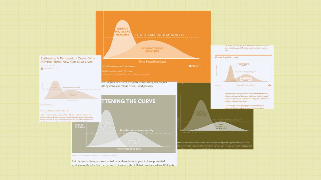
The “Flatten the Curve” Chart Was Ugly and Not Scientifically Rigorous. Why Did It Work So Well? [English]
Arguing towards the visualization of data, charts and graphs are more important than ever in aiding in the understanding of local and global situations, such as that of the current pandemic. The text describes how “pathogens can’t be seen by the naked eye,” reinforcing the idea that a cultural community of visual information is crucial to explaining, understanding, and combating a global crisis.
It’s Always Better to be Ready for the Worst
[Spanish; “Siempre es mejor estar preparado para lo peor”]
Many scholars and academic researchers are working towards developing models of prediction of patterns of COVID-19 in order to aid in informing and prevention of the disease. As the article describes, the pandemic has turned our society into a culture of numbers, and beyond being important for many public policy comprehensions, it also aids hospitals in understanding how to better prepare, plan, and dedicate resources appropriately.

Lockdown and school closures in Europe may have prevented 3.1m deaths [English]
Research conducted by the Imperial College London shows that the European measures of lockdown and closures were successful in preventing millions of deaths in countries like Spain, Italy, the UK, Germany, and Belgium.
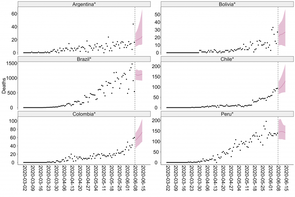
Short-term forecasts of COVID-19 deaths in multiple countries [English]
Research done in a partnership between the Centre for Global Infections Disease Analysis, Imperial College London, and the University of Sussex show projections for countries in all continents for expected total deaths caused by COVID-19. Brazil, for example, is expected to have over 7000 deaths in the upcoming week, a difference of more than 100 cases than reported this week. Predictions of deaths in Mexico are also of increased numbers, from around 4000 deaths this week to about 5500 deaths next week. In Latin America, Colombia, Bolivia, Panama, Argentina, and Peru are also expected to increase in number of deaths caused by COVID-19, but the rise is not expected to be as significant as Brazil and Mexico.

App by Google Indicates Minimum Distance to Reduce Risk of Contamination by the Coronavirus [Portuguese; “App do Google indica distância mínima para reduzir risco de contágio pelo coronavírus”]
Sodar, an app developed by Google, works to aid in putting social distance in action. The user opens the app (which does not need to be downloaded and can be accessed directly through Google Chrome), points their phone to the floor, and receives an automatic measure of his radius towards the next person. This app can be useful in current global efforts of reopening public places such as shopping malls, schools, parks, beaches, businesses, and more.
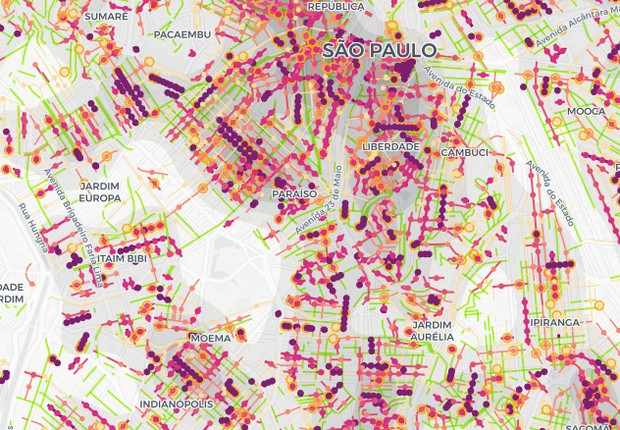
Did COVID-19 Arrive on your Street? Interactive Map Allows Research in São Paulo [Portuguese; “Covid-19 chegou à sua rua? Mapa interativo permite pesquisa em São Paulo”]
Researchers from a university in São Paulo, Brazil, developed an interactive map that allows monitoring of cases and deaths by COVID-19 in communities, villas, and streets. The main finding from the project debunked a popular belief by showing that favelas, or the Brazilian slums, do not necessarily hold the greatest concentration of cases or deaths.